How One Solo Designer Sparked a UX Revolution
Screens launched at breakneck speed. Buttons appeared where they fit, colors were plucked from thin air, and interactions felt like guesswork. Every feature sprint ended in a scramble of design debates and scrambling for consistency. I thought, “We have the talent to build anything… if only we knew what we were building for.”

The First Day in a Code-Only World
I still remember that morning. I walked into our tiny four-person engineering hub—three developers deep in code, and me: the lone designer. There was our team leader (full-stack wizard), a web specialist, a mobile expert—and myself, fresh-faced with a sketchbook in hand. But there was a catch: UX didn’t exist. We were at Maturity Level 0—no research, no process, no empathy for the folks who’d actually use our app.
Screens launched at breakneck speed. Buttons appeared where they fit, colors were plucked from thin air, and interactions felt like guesswork. Every feature sprint ended in a scramble of design debates and scrambling for consistency. I thought, “We have the talent to build anything… if only we knew what we were building for.”
Chapter 1: Planting the Seed of UX
The Reality Check
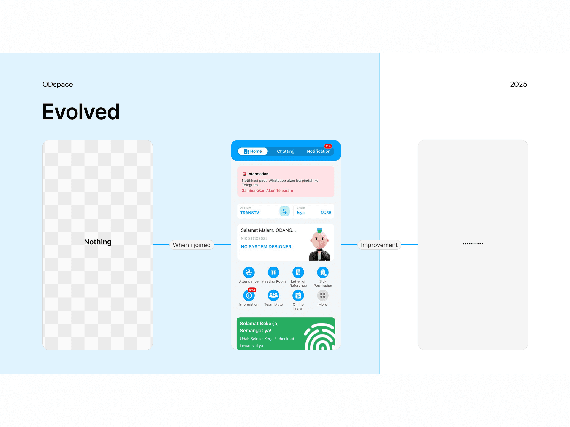
I needed their buy-in—but I couldn’t drown them in design jargon. So I crafted a 5-minute “UX Wake-Up”: two mockups side by side. One was our current chaos—clashing buttons, buried error messages, disjointed flows. The other was my vision: consistent tokens, clear feedback, intuitive spacing. When I revealed them, silence filled the room… then curiosity.
Solo Chats & Shared Pain
Over coffee breaks, I asked each developer: “What trips you up? What slows you down?” Their answers rang familiar—too many design back-and-forths in code reviews, guesswork on user needs, endless patchwork fixes. I summarized their pain points into a simple deck: Why UX Matters, Our Current Gap, and A Roadmap Forward.
Chapter 2: Crafting My Three-Hat Workflow
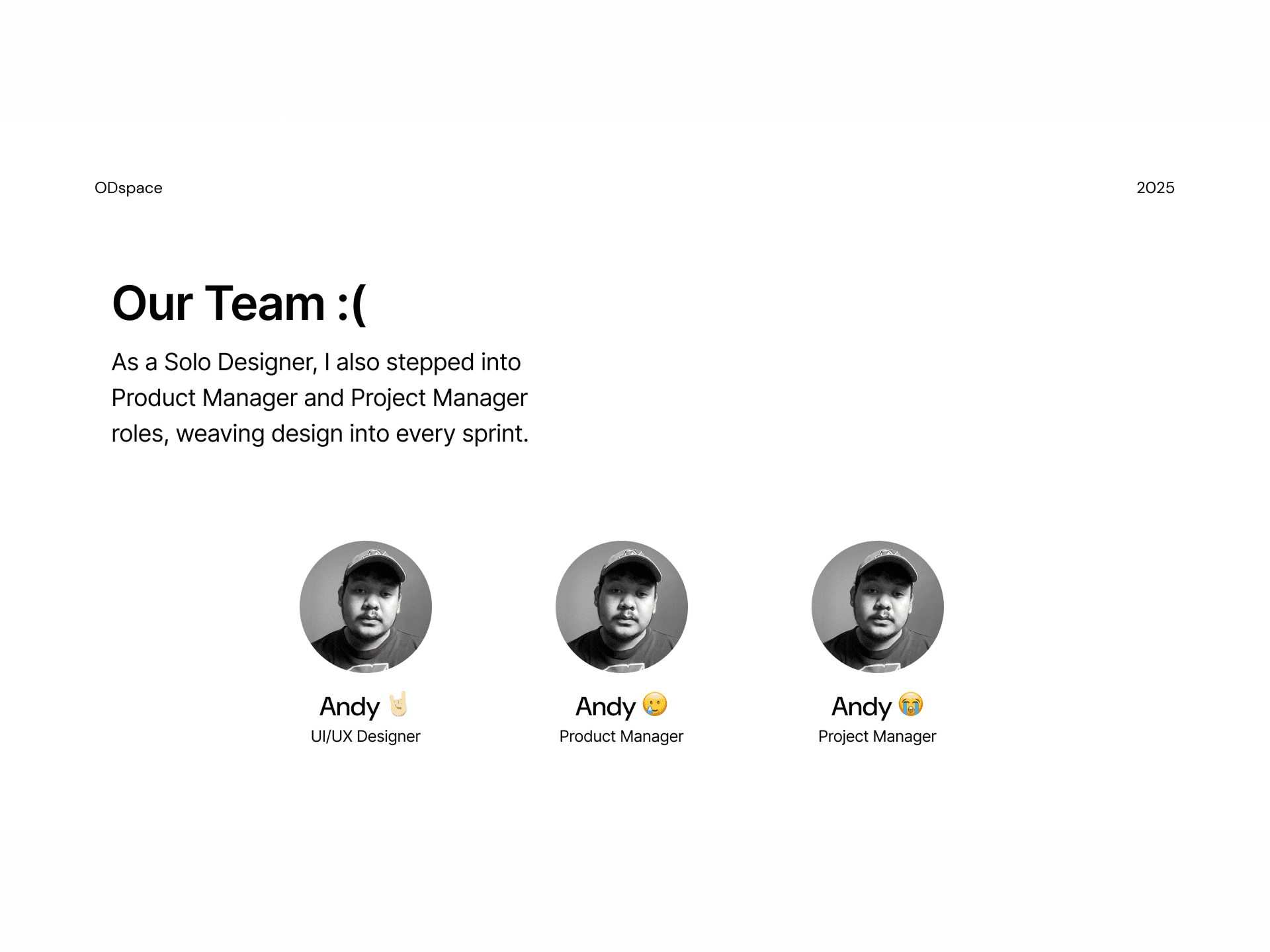
As a Solo Designer, I also stepped into Product Manager and Project Manager roles, weaving design into every sprint:
User Discovery in Five Minutes
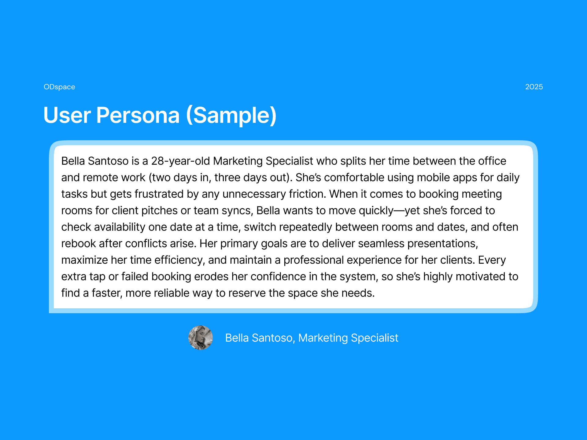
Launched guerrilla surveys and quick chats with real users—no fancy labs, just candid feedback.
Logged insights on sticky notes and shared them in our daily stand-up.
Lightweight UX Process
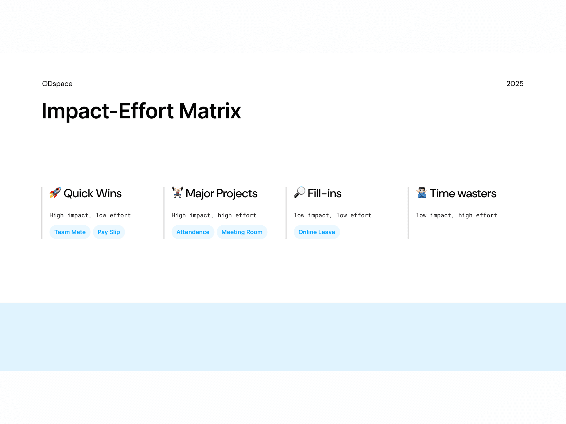
Defined a three-step pipeline: Discover → Define → Deliver.
Created a simple Kanban column for UX tasks—right next to “In Progress” and “Done.”
Wrote a UX Checklist (accessibility, clarity, feedback) that became a prerequisite for each pull request.
Project Management for Design
Blocked “Design Hours” on the sprint calendar—protected time to research, sketch, and review.
Introduced a “Design Minute” at every stand-up: two sentences on design progress or blockers.
Kept a shared roadmap that mapped user pain points to upcoming features.
Product Ownership
Prioritized features based on user impact and technical feasibility.
Drafted simple user stories and acceptance criteria, so developers knew exactly what success looked like.
Ran rapid prototypes to validate ideas before coding heavy lift.
Chapter 3: Forging a Living Design System
With my process in place, I turned attention to scalability:
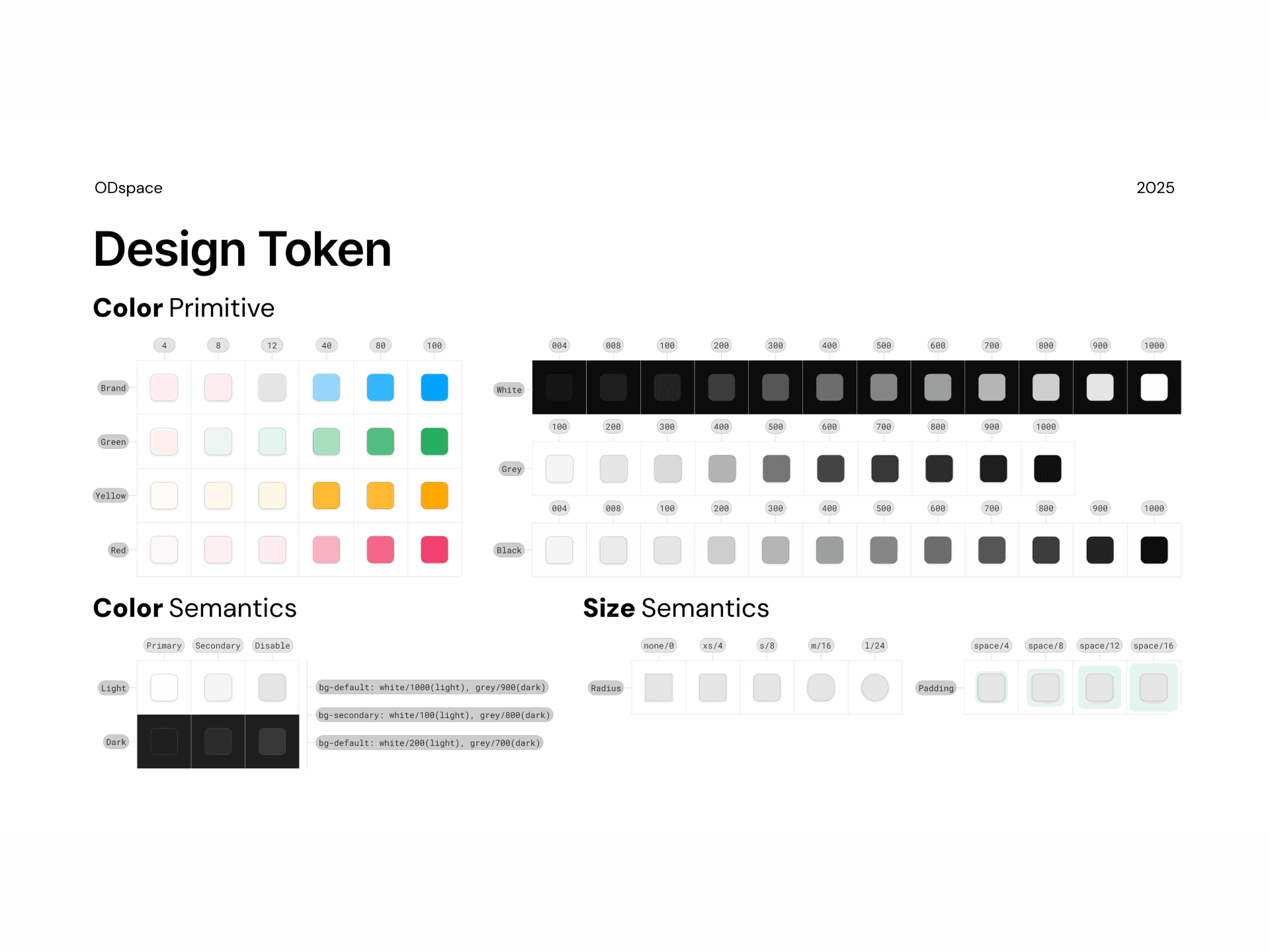
Tokenization in Figma
I built a Figma file of tokens (colors, spacing, typography) and primitives (buttons, inputs, cards). Each token had a clear name—Primary-Blue,Spacing-Medium,Heading-2—and was wired into light/dark modes.Component Library & Documentation
I assembled 20+ components, each annotated with states, use-cases, and accessibility notes. Developers accessed these specs in our design system file and saw how tokens mapped directly to code variables.Continuous Sync
I set up a simple export: Figma tokens → JSON → our React Native theme. Now, whenever I tweaked a color or spacing, the entire codebase updated automatically. No more copy-paste or guesswork.


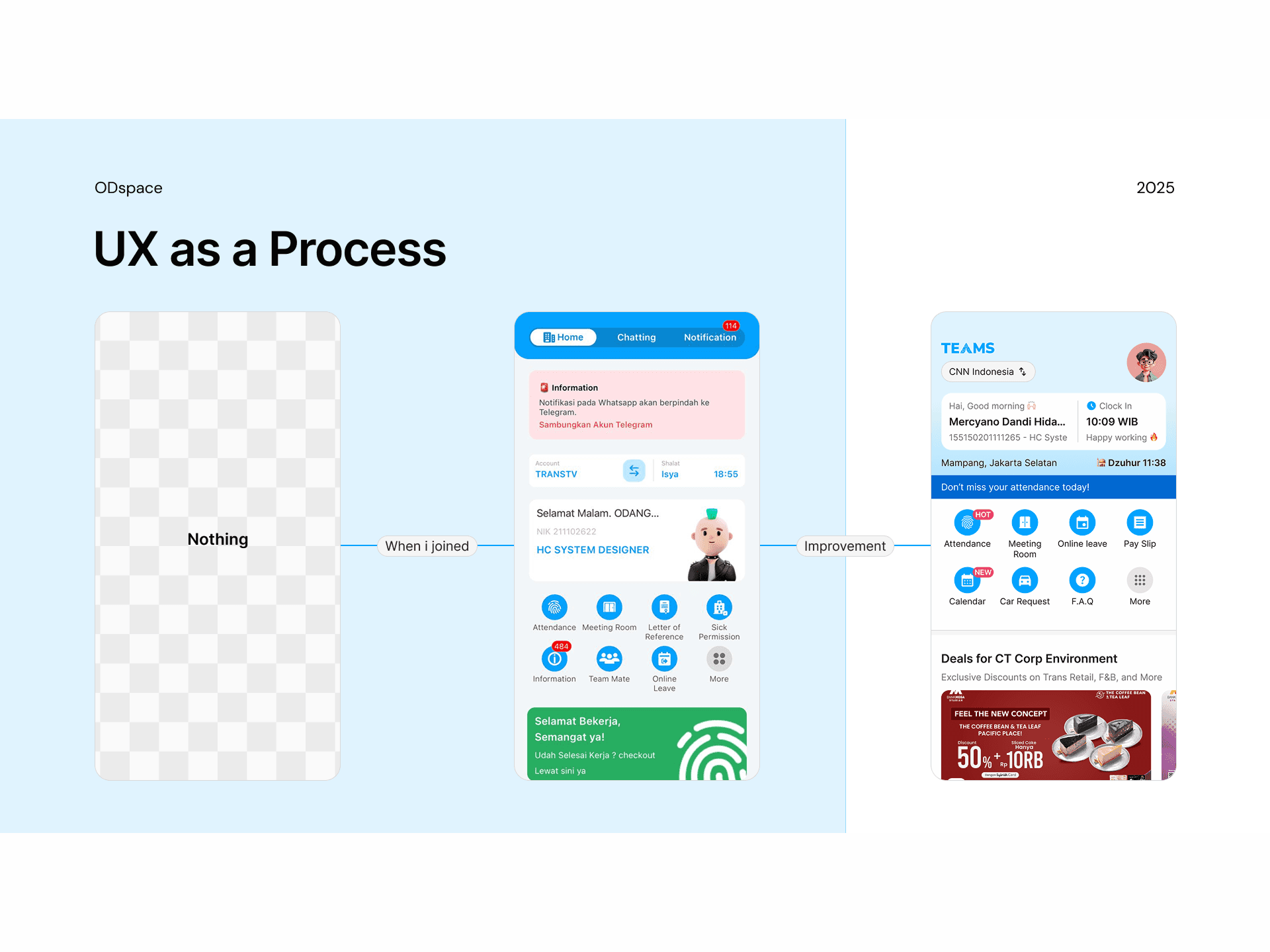


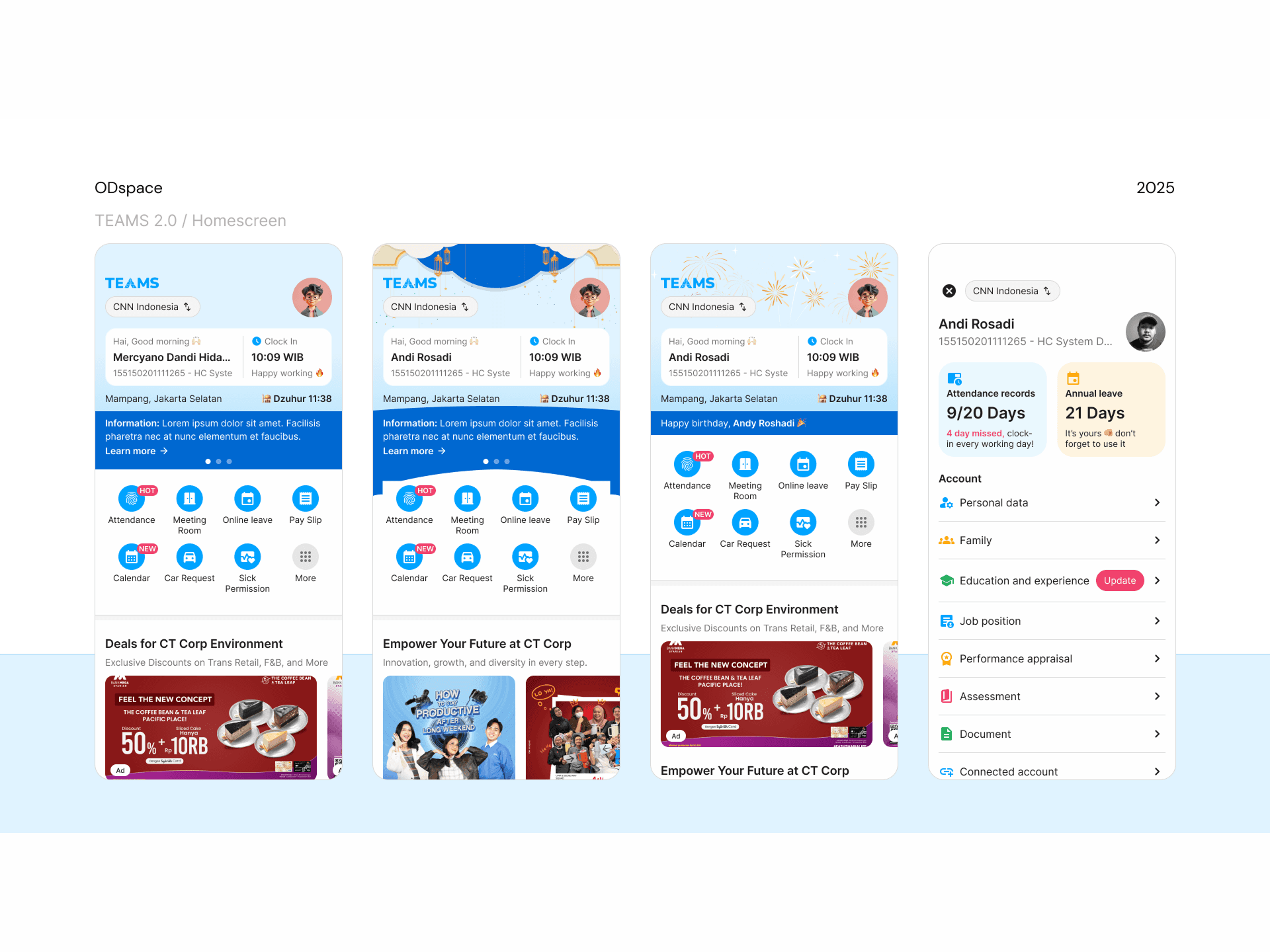
Chapter 4: From Fragments to Super App v2.0
Armed with our new process and living design system, I tackled the grand unification. What had been a string of standalone modules—onboarding, dashboard, chat, settings—became a cohesive Super App:
Consistent Language
Every interaction, from first tap to final screen, spoke the same design dialect. Users felt a unified experience, no matter which feature they explored.Faster Delivery
Developers wrote fewer custom styles and leaner code. UX tickets slid through sprints, and design reviews took 60% less time.Maturity Upgraded
We soared from UX Level 0 to Level 2: a team that plans, designs, and delivers with user empathy at its core.